


An in-depth study into how much social media chatter correlates with stock price
Part I

When I started Buzzing Stocks, I did it based on a hypothesis. The thought process was simple:
“I spend a lot of my free time on social media reading up on stocks and trying to identify trending opportunities before they ‘pop’, can I automate this process and save both time and effort? and is this even a good way to unearth opportunities?"
I established early on that not all stocks identified in this way are good opportunities. Lots of further research and due diligence is needed to assess them (and that’s what I try and do through this newsletter), but I never fully assessed or proved the underlying hypothesis of; does social media chatter have a tangible effect on or correlate with stock prices?
In this article, I will aim to answer this question and give a better understanding of how the two things relate to each other. Given that this is a complex topic, it will involve a number of graphs and explanation, therefore I will break it up into two parts.
The data
I used two main types of data for this analysis:
The daily closing stock price, sourced from Yahoo Finance.
Social media chatter, from (but not limited to) Reddit, Twitter, and Yahoo Finance. This isn’t publicly available, so I had to collect this data myself.
There are a lot of things you have to consider when working with social media data, including handling bot accounts spamming a specific stock (of which there is an increasing amount now, given how much visibility sites like WallStreetBets are now getting), misspelling of tickers and comments talking about multiple stocks at the same time.
I won’t go into detail about this too much since this isn’t the point of this article, but I am mentioning it to help your understanding.
The process
If you look at just the raw numbers (daily stock price by number of mentions that day) you would be hard pressed to identify a clear relationship or similarity. The reason for this is pretty simple, mentions are volatile (they move alot and change rapidly) and are cyclical in a way stocks are not, they repeat over quicker time frames (notice the dips every week as people take a break over the weekend).
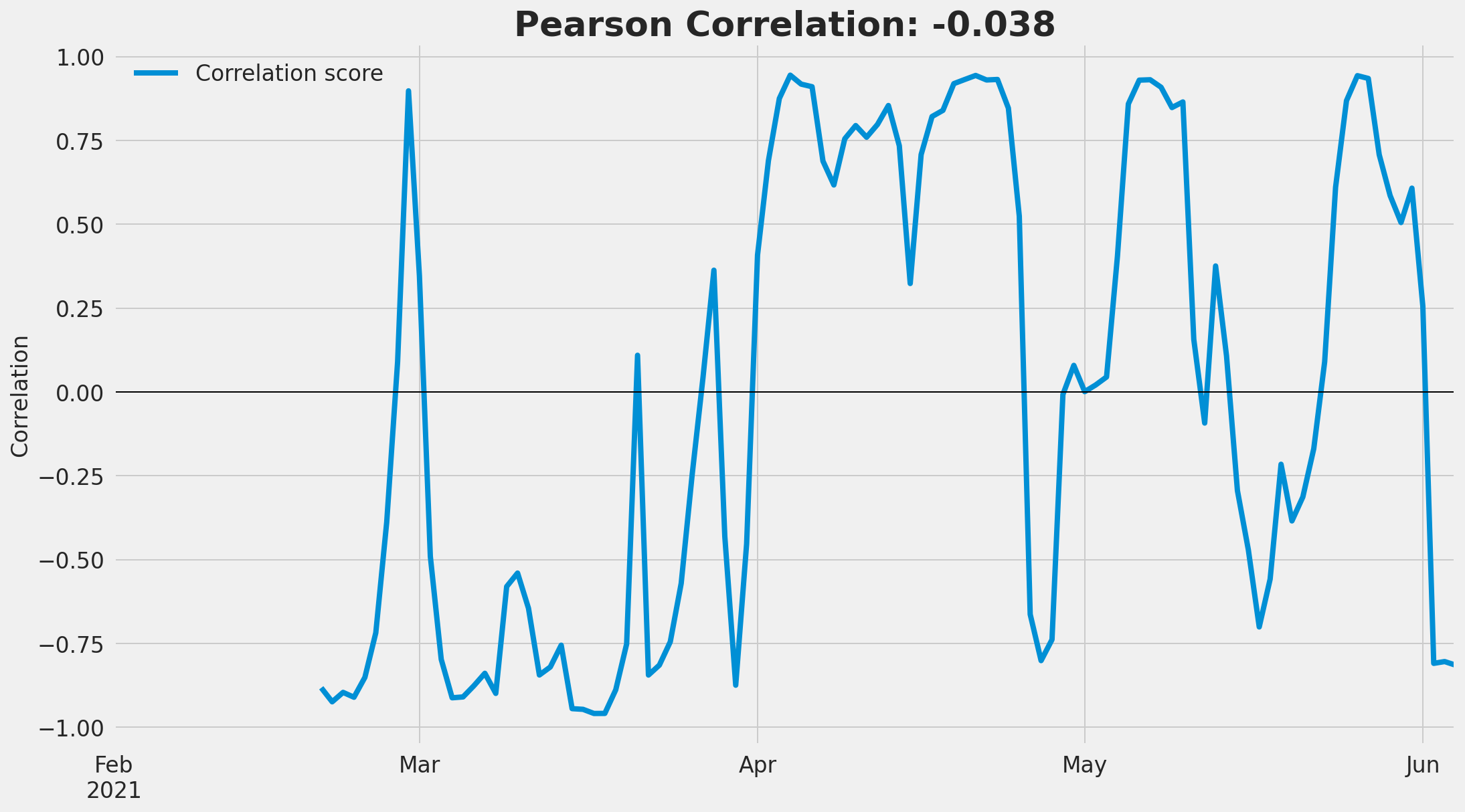
Below is an example for Apple Inc. Mentions move a lot more than the stock price, simply comparing the two may not yield the best results.

You can create a clearer relationship and remove noise by looking at the weekly percentage change between the two factors. Using the Apple example below, it’s easier to notice how the amount of chatter and stock price were anti-correlated (moved in opposite directions) all through February and March, moving more in lockstep in April as Apple went through a price rally.
We can measure the amount of correlation mathematically using pearson correlation scores. These scores range from -1 (perfect anti-correlation) to 1 (perfect correlation), with 0 being no correlation.
Applying this to our Apple example, the overall correlation is -0.038, meaning the two are very weakly anti-correlated (they move in the opposite direction). The strongest anti-correlation occurred in February and March, reversing in April as the price rallied.
It is this pearson correlation score that I will use moving forward.
The results
I calculated the correlation score for the stocks which have seen consistent enough chatter to analyse over the last 6 months (~1500 stocks) for a range of social media measures and aggregated the scores. This gives the results below:

This can be a difficult graph to understand, let’s step into it. The graph shows the distribution of correlation scores across the whole universe of stocks, split by the type of social media measure.
If we take sentiment (green) as an example, the distribution shows how correlated stock prices are to sentiment change. A distribution to the right means stock prices generally rise as sentiment increases, distribution to the left means price drops as sentiment increases.
Naturally, all of the 4 distributions peak at around 0 (or close to it, mentions and score are still rather wide around 0) meaning that the majority of stocks have a small to zero correlation to social media chatter, which is to be expected.
I won’t analyse all four distributions, let’s look the two that are most interesting:
Sentiment
Sentiment change (how positive or negative does the chatter surrounding a stock change over time) has the narrowest distribution of all four, with the highest peak around zero. This means that the change in sentiment is least correlated to stock price movement compared to the other measures in my study. This is mainly down to three main reasons:
Sentiment around a stock is generally more stable than other measures over time. People are either positive or negative about a stock for a longer time.
When sentiment does shift around a stock it tends to be a longer time before or after big price shifts, which will lower the correlation score (as correlation measures how the two move at the same time).
Sentiment is inherently difficult to measure, especially when you consider that people talk about the positives and negatives of stock in the same text. Because of this it can be difficult for an algorithm to come up with an accurate measure.
The takeaway?
Sentiment can be a useful indicator to understand how the general market views a stock, but its change over time doesn’t correlate well to stock price.
Mentions
One of the simpler measures here. This measures the change in how many times a stock is mentioned on social media vs the change in stock price. It has the widest distribution and the smallest peak at zero.
This means that while there are still stocks that are uncorrelated or weakly correlated to chatter, there is a significant proportion of stocks that do have a correlation.
The fact that the distribution is almost equally wide on positive and negative correlation is interesting. It shows that increasing chatter can correlate to increasing stock prices for some stocks, or decreasing prices for others. This is intuitive, people talk if something spikes but also if something tanks.
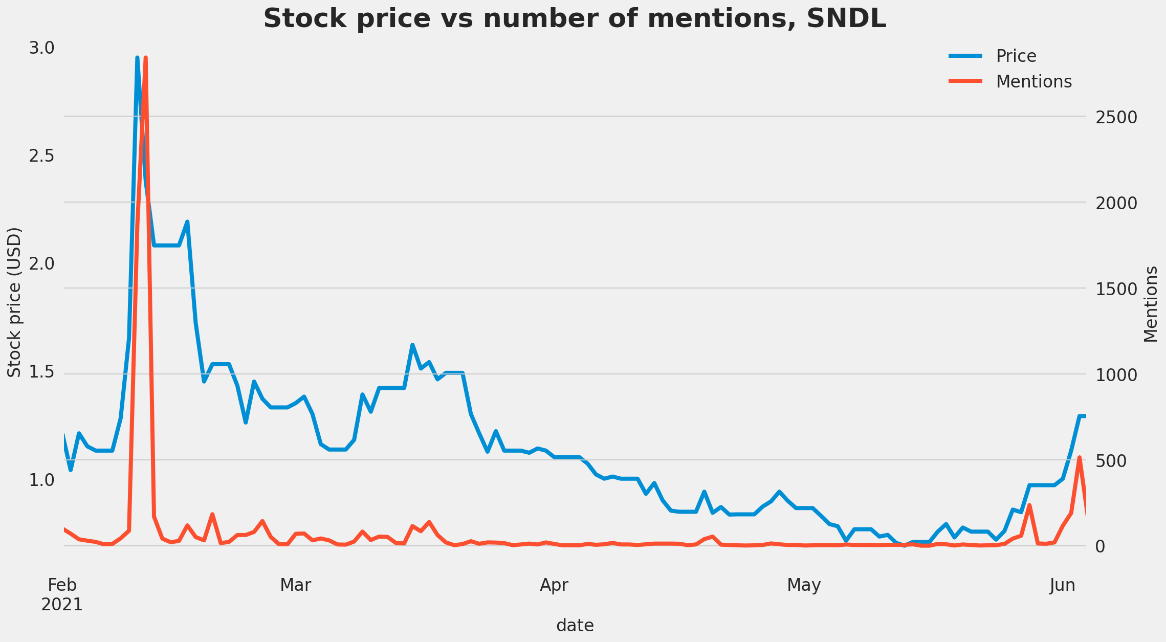
What does a highly correlated stock look like? Sundial growers (SNDL) is an internet darling, it’s no surprise that it comes out with a very high correlation score of 0.77. For the majority of this year, the change in stock price vs the change in mentions was almost perfectly in lockstep.

Taking this a step back, looking at the raw stock price vs number of mentions shows the same relationship. For Sundial, when people talk about the stock, it’s because the price is rising/will rise.
Delayed Synchrony
Now, the slight limitation with all of this is that pearson correlation measures how mentions and prices move together, at the same time. While this is still very useful, it would be even better if we can identify stocks that saw an increase in mentions before a price move, giving you time to act on it right?
Luckily, you can do this using something called Time-Lagged Cross Correlation, which involves moving two time series across each other to understand if they correlate more once shifted.
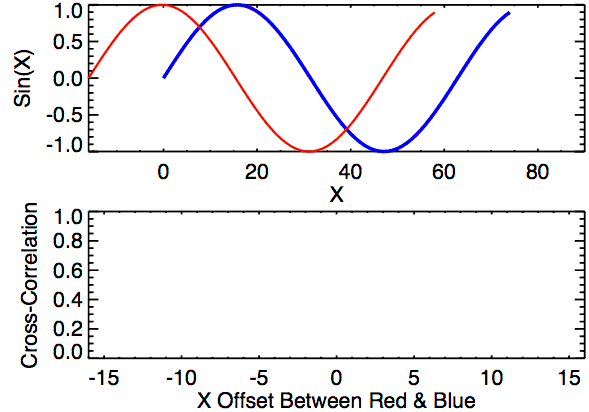
This will allow us to understand if a spike in mentions precedes a spike in prices, or vice versa. To fully understand the logic and trends behind this will be its own article, so I won’t go through it here (you can read more here), but I can show you how it identifies stocks that see mentions before price spikes.
The results of this are probably the hardest to get your head around, but let’s step through it. The graph displays at what shift the biggest correlation occurs. Unsurprisingly, the majority of stocks sit at 0 (either mentions move at the same time as stock price, or there is no correlation, therefore the model defaults to 0). Stocks to the left mean that stock prices move before mentions, which is the expected behaviour (people generally talk about a stock after it had a big price movement). What’s interesting is that for a small number of stocks, mentions occur before price movements, jackpot!!

What do those stocks look like? Let’s have a look at Core-Mark Holding Company, Inc. (CORE) below, which sees a spike in mentions roughly 18 days before a price move.

Notice how there were two spikes in mentions, in February and April, followed by two price rallies. Using our previous correlation measure alone would have shown a negative correlation as mentions drop with the rising price, but this method shows us that in fact the two are slightly delayed instead.
The conclusion
We have proved that for some stocks, there is indeed a correlation between stock prices and social media chatter, with the strongest correlation occuring between the number of mentions/comments online; the weakest being the change in text sentiment.
We have also shown that for a (smaller) set of stocks, we can identify a trend of mentions occuring before price movements.
These two points are really powerful, it proves that the Buzzing Stocks algo is capturing the right data and accurately removing noise.
Now that this hypothesis has been proven, I will use it moving forward as an extra filtering criteria when bubbling up stocks to talk about in this newsletter. This should hopefully translate to even better calls in future.
There are still a few things left to answer:
Is there a pattern or trend around the stocks that correlate highly with social media chatter?
How big is the “lag effect“ of mentions that precede stock price movements? Is it big enough to make a trading gain off?
Are those patterns repeating? Is the pattern strong enough that we can have some confidence in it repeating itself?
Stay tuned for part II of this analysis where I will drill into the questions above and more 👀
What do you think of the analysis above? Let me know by dropping a comment 👇